Posts: 2,241
Threads: 102
Likes Received: 2,230 in 1,064 posts
Likes Given: 7,206
Joined: Mar 2019
Location Farlington, North Yorkshire, UK
Posts: 2,241
Threads: 102
Likes Received: 2,230 in 1,064 posts
Likes Given: 7,206
Joined: Mar 2019
Location Farlington, North Yorkshire, UK
Can I ask how you all feel about having the icons for navigation at the top of the pages, rather than text?
My feeling is that it seems fairly intuitive, and from a geeky web designer point of view, it helps us to provide a similar experience across a range of devices, from mobile phones, to tablets, to laptops and desktops.
Any thoughts?
![[+]](https://slotracer.online/community/images/bootbb/collapse_collapsed.png) •
•
Posts: 1,919
Threads: 116
Likes Received: 3,141 in 1,291 posts
Likes Given: 2,714
Joined: Sep 2020
Location A small igloo in Canada
I'm very flexible, and can easily touch my wife's toes without bending a knee.
It sounds good. Nothing is etched in stone.

![[+]](https://slotracer.online/community/images/bootbb/collapse_collapsed.png) •
•
Posts: 431
Threads: 32
Likes Received: 183 in 121 posts
Likes Given: 503
Joined: Apr 2019
meh.... as long as it is painfully obvious what they are.
I was a big fan of physical media (still am) but Universal Studios use some symbols for things like Chapters, Settings, Extras on their Blu Rays and I NEVER know what is what...
I complain to the UI guys at work all the time about how you have to hover the mouse over or tap something "for fun" to figure out what to do.
They always seemed shocked that someone would like to KNOW what happens BEFORE they attempt something rather than stabbing in the dark and then having to commit what few grey brain cells work to what the 3-legged octopus on a stick symbol might mean... and then it is all CLOUD based and works totally differently 3 weeks later
AAAAAAAAAAAAAAAAAAAAAARRRRRRRRRRRRRRRRRRRRRGGGGGGGGGGGGHHHHHHHHHHHHHHHHHHHHHHHHH!!!!!!!!!!!!!!!!!!!!!1
I need a drink...
![[+]](https://slotracer.online/community/images/bootbb/collapse_collapsed.png) •
•
Posts: 2,241
Threads: 102
Likes Received: 2,230 in 1,064 posts
Likes Given: 7,206
Joined: Mar 2019
Location Farlington, North Yorkshire, UK
(30th-Oct-20, 10:55 PM)dvd3500 Wrote: meh.... as long as it is painfully obvious what they are.
I think it is, take a look.
Posts: 1,703
Threads: 253
Likes Received: 1,508 in 787 posts
Likes Given: 1,715
Joined: Apr 2019
Location Edinburgh, Scotland
(30th-Oct-20, 07:13 PM)JasonB Wrote: Can I ask how you all feel about having the icons for navigation at the top of the pages, rather than text?
They are an excellent way to make the forum and therefore the hobby current. Younger people (say under-50) will relate to them immediately as they are all over social media and portable devices.
Having the popular icons can only help the sustainability of the hobby.
Predictably some people on slot forums will not like/understand them, but only a few. Never let the tail wag the dog.
Leo
Forum Precepts: Don't hijack or divert topics - create a new one. Don't feed the Troll. http://www.scuderiaturini.com
Posts: 3,798
Threads: 642
Likes Received: 8,153 in 2,909 posts
Likes Given: 8,718
Joined: Apr 2019
Location Worthing, UK
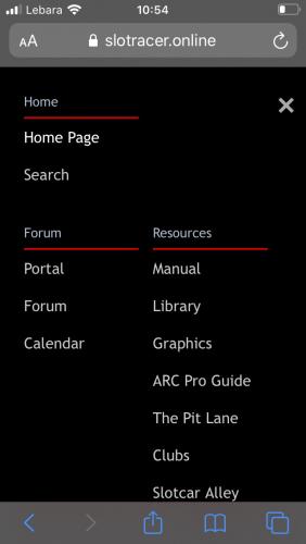
The icons and the general layout of the new homepage make the site much easier to navigate and read on a phone - even a tiny 4-inch display...


The new drop down menu works nicely too.
The homepage looks superb on a laptop/desktop or tablet, but it is a huge improvement on a phone. Excellent work

Posts: 2,241
Threads: 102
Likes Received: 2,230 in 1,064 posts
Likes Given: 7,206
Joined: Mar 2019
Location Farlington, North Yorkshire, UK
Thank you gents.

Making the site more consistent across devices was one of the main aims of this change. Obviously it's a huge challenge to fit the same information that fills a big old desktop monitor, onto a much smaller mobile phone, so I'm happy to hear its an improvement.
Posts: 1,215
Threads: 84
Likes Received: 987 in 498 posts
Likes Given: 225
Joined: Apr 2019
Location France
Hi Jason,
You will be pleased to know that it still doesn't work in Firefox on my Mac

No icons, no nuffink! Just a mismash of bits!
AOK on Safari though so you have the use of that browser all to yourself

![[+]](https://slotracer.online/community/images/bootbb/collapse_collapsed.png) •
•
Posts: 2,241
Threads: 102
Likes Received: 2,230 in 1,064 posts
Likes Given: 7,206
Joined: Mar 2019
Location Farlington, North Yorkshire, UK
(31st-Oct-20, 12:06 PM)Gordon Steadman Wrote: Hi Jason,
You will be pleased to know that it still doesn't work in Firefox on my Mac 
No icons, no nuffink! Just a mismash of bits!
AOK on Safari though so you have the use of that browser all to yourself 
So it was working a few days ago when you were looking at the Racing Greens section, but now it's not working?


